Tuesday 30 November 2010

Screenprinting, COLOUR?

Tonight I've been thinking about colour combinations and colours which will give my card designs a cute and vintage look. But I also need to be careful that they are not to loud and don't detract from the jewellery.

I came across this guys work:
I love the colours and think they complement each other amazingly well, although I think they might be to bright for the 'vintage' look I want. When I first think vintage, I think of browns and pinks, blues, well all pastel and light/dull shades of colour.
Although the images themselves aren't really my cup of tea, I love the colours used in the following images...


The idea of using one colour in different shades has crossed my mind, from looking at the bear all in blues...or I could do the opposite and produce bright images!

Saturday 27 November 2010

Ideas...for Logo.

Below is a screenshot of my first go at trying to figure out a type to use for my brand name and also trying a logo design out. I still havent decided between Pageant or To Pluto as a name. I like the logo, design although it looks quite graphic, perhaps it should be more illustrative?

Research into Logo Designs...

I've been looking at already existing logo designs to inspire for the work I'm doing with my brand name 'to pluto'...It's made me think a lot more about using colour within the logo that I screenprint onto the back of my cards...

The card below had a classy feel about it, not only the design but also the name of it...
The illustrative style of this one is really nice...
The type is lovely in this one, but it's not the sort of things I would use...
I like the pattern round the edge of this logo, it has a floral/vintage feel to it...
I like the old object used in this one...


Friday 26 November 2010

Logo Research.

Here are some visuals I've been looking at to help in inspiring me for a type with a 50's feel to it. I've been looking at 50's magazines and 50's adverts for help...
The Magazines were a great help in finding a name for my brand, the words are all words that were used during the time period my work is set in and that then seems to fit the brand name...


Whilst, the adverts were really good in design and visual ideas for my logo design and type design to my brand name...


Typefaces.

Today, I got some help from a couple of the graphic designers amongst my year! I was asking for help in how to go about choosing a type. I got onto this site... FONT SQUIRRAL
Which is amazing and has more typefaces than you could ever imagine...


They also mentioned a really good book to look at which I got out of the library:

It tackled this idea of corporate identity and it's logotype. But with no rules, so anything goes. It talks of young entrepreneurs and the contemporary designs of society today which need cometitive logos to go with them. The book identifies 10 key 'rules' of logo design, such as 'keep it simple' and 'make a mark which is unchanging'.


Tips the graphic designers amongst our class gave me were...
- Do it in illustrator, repeat the word in different type faces
- Always think about what size you're going to be using it and the spacing between the letters
- Always print it out to see how it will look at the correct size
- Take into concideration how you are going to apply it. If engraving think about how slim some serifs are.

Also I've been looking at Paul's work as he mainly has worked in 50's typefaces with his ' ' posters around the city. I've been looking at his blog and taken some inspiration from the types he's been using...also from his screenprinting work and like the layered effect he has which is scrrenprinted which gives depth and a 3D feel to the work. Then I though about how the laser cutter enables you to engrave/kiss cut/cut through and raster, which I could combine to get this 3D feel.

Other Brands...

I've narrowed down my brand name to 2 possibilities now, which I will design around:
'To Pluto'
&
'Pageant'

Think I'm going to produce Logos around the names for the back of my jewellery. I've been looking at others approaches to this...


From exploring these, I know that I need to search high and low for a good type to suit my brand title...I also love Good Woods' idea of putting the date on them...with the size of my pieces and having a brooch back on the back of it, I'm going to have to see how much room I have to do this... If I was to make a collection of necklaces this would be okay and space wouldn't be a problem. I may have to leave he logo engraved on the backs of the brooches and they are just not big enough, or maybe just put one letter on it. I think this is something I willeave for now and build upon as the brand grows.

Thursday 25 November 2010

Card Ideas...

For my packaging I want to make a series of cards to present my jewellery on...stuck with the painting of the women although I'm going to add to them to give it a border possibly...screenprinting them next thursday and Friday.
I had 3 different dot patterns which I chose from, the little dots seemed to insignificant and the bigger dots were to bold and took the emphasis away from the illustrations, but I guess this depends what colours I print the dots.
I tried other patterns underneath my illustrations...
...and others, When I was preparing the image for print, I separated them so that the background pattern wasn't shown through the face. But in some of the clothes of the women, I left the pattern showing through the jacket of cardie.
Also been thinking about the fact that I don't want the brooch pin to go through the card as it's a nice print to keep as well when the brooch comes off. I'm pretty sure you can get some sort of sticky foam which is to put badges through?

Brand Name...

I've been looking in books and all over the internet for inspiration in finding the perfect name for my jewellery. I resorted to looking at vintage/50's women magazines. Some of them are lovely and the type is pretty cool! Here are a few...


The colours and type in them are beautiful and the simplicity of some of them
I've been playing around with my paint brush and writing some of my favourites down...

At the moment I am drawn towards Nymph, To Pluto and Pageant. From asking people however, the word Nymph, which I understood as a spirit and cute and pretty, they said that it made them think of nymphomania, which is someone with an uncontrollable desire for women - addicted to sex. Therefore it has put me off using this completely, no matter how much I love the word.

FInishing Image for 'On The Wall'

I have decided that I'm going to take Simon the cardigan image, but also the 1950's beauties I have been working on. Today I have been finishing the cardigan image...adding colour or taking away colour. I'm going to screenprint it next week just to see what it looks like, but I will take both versions, the digital print and the screenprint to Simon. The only thing about screenprinting a painting is you loose this quality, but it could cause really nice different thickness in line being quite nice!

We shall see...Here's What I've been working on...


I've also been working on making the 1950's women look nice by using photoshop...


Friday 19 November 2010

CRIT.

Well, I don't have long left now, in-fact, the deadline I have set myself is for the final Crit, to have all the creative work done, then I can concentrate on putting together my final report submission. I have already started thinking about it and writing it, which is important as it's important to start pulling it together as it is the biggest requite of the brief minus 'professionalism'!

To start, Matt and I discussed what I wanted to have by the final Crit...I want to be able to show people what I'm going to submit, minus my report. Therefore, I need my blog to be update, and all my work almost ready for the craft fair. I need to also have my final image for Simon at 'On The Wall' and all jewellery design up to date.

BROOCHES.
My main focus is the next 'Reetsweet' craft fair on Sunday 5th, each time I have gone to a fair, i feel I've been more and more prepared and now this is the last push. I need to have a business card ready which I have decided will roughly look like this:
photo

I need to refine this design and from what I've learnt about the laser cutter, I'm going to create it all using the pen-tool, this means they will cut quickly and I can produce lots in the timescale I have... I need to reduce the size of the grey space to fit the sticker design as the size of the grey one above is a bit too big for someone to take away and comfortbly carry around in their pocket. I think the design is good as it's what I'm about, integrating my illustration, use of the laser cutter and love cutesy things. So, for in the next week I need to:
- Buy more grey card (The pink complements the grey really well)
- Get creating the doily pattern using the pen tool and resizing it

Another important aspect of it all is, creating a 'Brand-name', in discussion with people, whether to just use my name or an actual brand name, people have advised a brand-name and from watching 'the influencers' and doing a little research it is clear to see that, this is what makes things catch on and people 'big-up' a brand

As well as the brooches themselves go, I need to refine them lots, I tried out the designs I had, and I'm not sure on the quality of them. From speaking to people they have commented on the clarity of them. Something which was important to me was keeping my illustration style within the brooches, so they had some illustration style to them and also thought this would give them quirky character as everything we see today in a jewellery piece is really defined. However, from doing some little experiements
It also seems that the favourite wood for me to use is 'American Cherry', I've used pretty much all the samples I created and they seem to come out the best on the 'american cherry'. It's the most expensive wood, but the line work looks much nicer and well defined/clear. On the other woods it just doesnt seem to cut it. The oak is a little too dark and so the image looks a little dull and blurred and on the cheapest wood I had, the rings (of it's growth) vary in darkness and lightness, meaning that some bits of the lines rastered into the wood creating the image look darker and merkier than others, giving the image a blurred and confused look, with different lines of tone running through it.

Matt and I discussed making the brooches a little more graphic and refining them using the pen-tool in illustrator to get these crisp lines and anchor points. This should give lots of clarity to the line work of the piece...I may however draw them all again first then to go over them with the pen tool. I'm going to come up with a new cardigan, refine the spoon and refine the perfume bottle.

One other thing for the brooches is producing a nicer illustrated backing for them, since my crit I have been sat mocking up idea for the backing of them. One Idea I had, was to make them all into cards...easily given to people as a gift then... I do know that I want to stick to pastel colours.


'ON THE WALL.2'
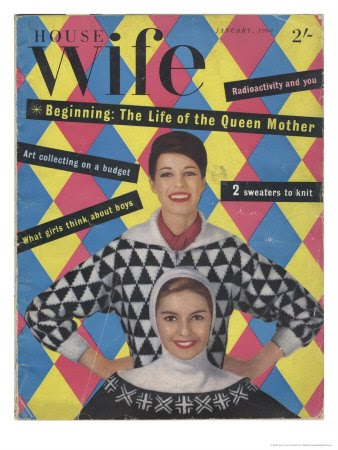
The image for Simon at 'On The Wall' which I have started putting together is the cardigans...
picture...

I'm not sure about a couple of the paintings so might change them, the most important thing now is getting a quirky quote to finish it and complement the cute cardies...which I'm going to do by talking to people and asking them a bit about their cardigans! Once I have the final image I'm going to change the backing colour to something other than white, perhaps a nice pastel blue/pink or red? ...then having the cardigans as a nice charcole black. I want digitally print it and screenprint and see what difference I get.


Sunday 14 November 2010

Triangular Design Manifesto.

Came across this today, it's called the Triangular Design Manifesto and states 10 things about design. It's clever and fun to read, although I'm don't really agree with all 10 points.