Thursday 30 September 2010

Body Image articles... Research.

I've been looking at the issues in society surrounding this idea of stiving for beauty and perfection...shockingly finding some sad statistics...

Two out of five women and one out of five men would trade three to five years of their lives to achieve their weight goals. ‘Young girls are more afraid of getting fat than they are of nuclear war, cancer or losing their parents’. Shocking, but true. Also Reading a lot around this subject and relating it to my dissertation has been really influential also, in reading for my dissertation I learnt about this idea of women feeling they have ‘lost control’ of their bodies and getting older and ageing is one thing which terrifies them, an article which I came across was a reality of this, a young woman aged 23, scared of aging, and through starving herself, putting her life in jeopardy.


Below is a shocking article about a woman aged 23, who was so terrified of growing up that she starved herself. To stop herself growing 'older' she sticks to a diet of less than 1,000 calories a day - a regime that has stunted her height to 5ft 2in and keeps her weight at 5 1/2 stones. The dieting has come terrifyingly close to costing Miss Hensley her life. This shows the 'lack of control' women face, which Naomi Wolf talks of in her Book - The Beauty Myth.


There are also celebrities who have starved themselves, sadly Anna Carolina Reston, a model, got so thin that she died.

Looking into what's happened and happening in society today is really useful in being inspired and also understanding what really are the reasons behind my work and what an important subject it is to make people aware of.

Design: Doily.

So, 'design doily' is underway and it's going to be a very tight on time, I've had to draw myself up a rough timetable, to give me an idea of when I'm going to get things done In time for next Sunday, like booking the laser cutter (which plan to do today) to cut the doily design out and also the long processes of screenprinting the image into the middle of my doilys.
I had thought about cutting the design out free-hand, but this will be something that I try at a later date as to try and achieve that now within the space of a week would not work out!

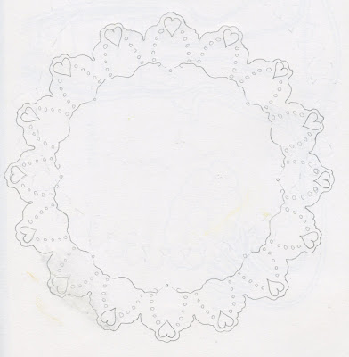
The print will be in the middle of the doliy but on some sort of coloured card and a cut out doliy design will border it, here are some initial drawings...


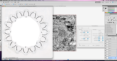
...I have then put them in illustrator and tidied them up a lot read for the laser cutter:


The Drawbridge.


When I attended the Paul Davis Lecture back in July, he mentioned that he was the drawing editor of The Drawbridge:
http://www.thedrawbridge.org.uk/ which is an independant quarterly delivering though, wit and reflection through words, photography and drawing. It is said to be: 'critically nonsensical and radically serious'. I had ordered Issue 15, entitled: 'First Love' (Above) and today it arrived!

The Drawbridge takes the form of a full colour newspaper, designed elegantly and in each issue, authors and artists cast an unflinching look at a selected theme and then produced in the magazine are a suprising combination of views and insights/ways of interpretation of that theme. This is what I'm trying to come to terms with in my work at the moment and I want to try and take things which I see, in this magazine it's really interesting to see the different ways in which artists and authors have approached a specific theme. It's helped me to understand different ways in which you can react to things and how to then/how you could reflect this or communicate this in your/my work. I also really like the concept and how simple the idea is, bringing people together to produce their own interpretations of a specific theme and putting it together in a witty, clever and attractive way. I want to look at more collectives coming together to present their views through illustrations...


“A cunning construction of reinforcement and defence, The Drawbridge lives up to its name.”
John Berger

Wednesday 29 September 2010

Maltese Lace...

Whilst in Malta over the summer, I got very fond of Maltese lace which is famously sold in many destinations over the island. I think it's really very pretty and it made me think further about the idea of a doily, which I haven't seen in years...

Lacemaking in Malta and neighboring Gozo trace their origins back to the 16th century. Needlelace was made there as in was in Venice. This continued until the 19th century when the depression that descended upon the islands nearly led to its extinction.

One of the most recognizable traits of Maltese and Gozo lace is the creamy, honey colored, Spanish silk from which most of it is made. Black silk was also used until the 20th century when it declined in favor so is harder to find today. Later linen was also used in some pieces used for household purposes instead of clothing, as it was more durable. Maybe I should create some of my doily patterns in fabric and actually make my own doilys?


It also reminds me of the cut out pattern that I admire in Rob Ryan's work so much as well!!

Craft Fair Ideas.

As well as my 'Air-Berry' prints, I'm thinking of what I could put together in the time I have left for Handmade 3. Last night I made a massive mess in my sketchbook with ideas and thoughts I've had recently.

I've been reading for my dissertation quite a lot recently and am becoming more and more interested with this idea of female body image and the pressure which young women and girls find, face them every day, through media, men and pressure from society in general, to conform to these uncanny norms and values.
I've been looking into this idea of perfection:
...this lead me to think about what's normal and to the old education books...

I've been reading the books for my dissertation and also a really old sexual education book from the 80s, which is a laugh a minute with some funny comments made, which also include ones about weight and the way you look... I've written these down as a possibility in including them in my work.
I've now gone on to look at Doily's but my initial influence for this idea stemmed from a corporate logo I came across whilst looking for interesting ways/things to screenprint onto. It's a corporate logo heart shaped ornament which is up for sale on a site which sells christmas products. It looks pretty (minus the type and stuff in the middle), and I think it looks more precious and pretty than a print just on normal rectangular paper.
At the moment I have an increasing obsession with pattern on and from doilys that I've found around the house from back home, but also I've had a look online and seen some. I'm going to design my own doily pattern from looking at these original doilys and then want to screenprint an image in the middle with some text, in light of this attitude towards the female body.

I'm hoping to get a couple of variations, although with time not on my side, I'm just going to have to go with it. So I've started to draw up some doilys...

Tuesday 28 September 2010

Inspirational Quote...


'I used to fret and worry about how to constantly be impressive, but now I don't waste time doing that. The drawing only lasts for how long the viewer looks at it—maybe only a few seconds—so
now I prefer to get the job done well and get it done efficiently. Doing this frees me up to do stuff I take most pleasure in—i.e. work that is totally in my control, based on what I think and what I decide is essential to me'. - Paul Davis

I took this quote from an interview I'm reading with Paul Davis and he tried to re-alliterate this throughout his lecture. These words are important for me to keep in my mind as I work through projects this year, as I always feel the need to impress and a pressure which sometimes stunts my work load.

Sunday 26 September 2010

Handmade 3.

Handmade, is an arts and crafts fair which is held around Leeds, last Handmade (2) Paul and I sat with a stall, selling peoples work, although the weather was shit and it was badly advertised so there wasn't much action or stuff sold.
In 2 weeks time, it's back again, with the chance to make some work and show/sell it. Hopefully the turn out will be great! ...and so I'm beginning to think about what I could produce in the 2 weeks leading up to, working on a tight timescale and deadline is good practice for me and I will definitely require these skills working in professional projects. I'm going to take some 'Air-Berry' prints which I did right at the beginning of this project, but I hope to get something else together for it.
In order to go about this project professionally, I'm going to make endless lists and write a timetable of deadlines for myself to keep to and work to them as goals.

Conversation with Hannah McVicar.

Over the last few weeks I've been in contact with Hannah, she's been away for a week but shes' just got back to me about coming up to see her. Unfortunately I couldn't make the tuesdays' in September with no student loan and train tickets to Bristol being about £70!! But I gave her dates towards the end of October and we're now in contact through phone, so she text me saying not to worry and that she will be in touch about what date is best for her... I very excited to visit her!


Saturday 18 September 2010

Adding to the Prints...

Every evening I've come home from printing during the day, I've been trying to add to the screen-prints and fill in gaps I've purposely left, using different ways of drawing/illustration, still based on the same idea of design. Below are some photos of development work... I like the way the illustration sits with the screenprint, although it does make the print look a bit devalued.

Colouring pencil...
Pen...
Inks...
Collage...
Inks...
Different colour combination prints... is it to playful?


Thursday 16 September 2010

Printing OTW - Testspace.


Whilst working i've thought about the work which I'm going to give to Jodie for the Test-Space gathering and realised that my name or blog address is not on my work and wasn't when I last went to Handmade.
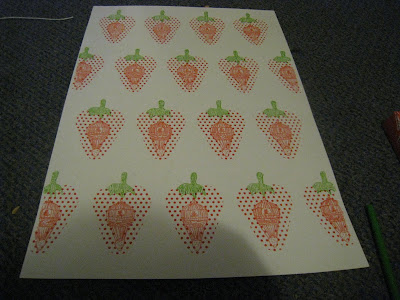
Whilst printing today I quickly (which isn't good of me), wrote up my name, blog address and title for the work, then to put it on a screen and screen-printed my name onto the back of some of the work I had done to give to Jodie. The prints I gave were some repeat patterns that I created through printing the small strawberrys.

So therefore, I think throughout this project I will think about the design of a type of 'stamp' for my work and recognition.

Tuesday 14 September 2010

Printing In Halftones.

From looking at some other artists approaches to printing with a 3D effect, I have picked up on the 'Halftone' printing that they use in order to achieve this. Printing your image in a different dpi, so that the image is translated into dots when you print it on a laser printer before going to expose an image and screenprint it.


Monday 6 September 2010

Collecting: Leeds Art Gallery.

Today I went to collect my work from the Art Gallery and too take a quick peek at the open submissions exhibition. It was pretty embarrassing walking out of the gallery with my frame and work in my hand!

To be honest, I don't know whether I was just bitter and in a sulk because my work didn't get picked. but I wasn't overly impressed with the work displayed. Some of it was brilliant! There was a lovely piece which was 3d and was stamps cut into the silhouette of butterflies and put into a 'museum-esque' case/frame, with brilliant colours! But from other pieces, I just seemed to get the feeling they were in the exhibition because they were really different so stood out, but maybe not for the right reasons? But hey, it's all opinion based...

When I looked around at the work picked, I feel that now, I wish I had submitted my laser cuts as they would have stood out and been pretty different from things that were in there. Maybe there will be another opportunity to show these.

Sunday 5 September 2010

Prep of Images for Screenprint.

Today I've begun preparing some of the 'air-berry' images for screen-print that Simon would prefer in print form...It's a nice way to start my summer :)
I spent a couple of hours, writing down different combinations/colours to print in, that would compliment each other, design and positioning on the page and also thought about papers I would print onto and the possible paper colours I could print onto.

I've been sat on photoshop and illustrator this morning seperating the layers of each image which I need to print, I think I'm going to need a few screens!
I'm still deciding on colours and how many colours to separate out and print and onto what paper?

Friday 3 September 2010

Wall Art.

As I'm going to be producing some work for 'On The Wall', in the hope that Simon likes it, I started to look at places online which sell 'home' type stuff, and who have art sections on their website, seeing what type of art people buy for there homes, one of these websites was Habitat - which stand for 'this is my habitat', selling furniture and objects to decorate your house.
This sort of research will help me in understanding the kinds of images people spend their money on for decoration.

They have work from photographic looking stuff, to messy/contemporatry painting/mark making...
There's also more intricate line drawings and contemporary colour...
There's also type based images...

It was interesting that on the website there was no repeat pattern design work, is this trying to tell me something? Or is it an opportunity for me?

Thursday 2 September 2010

Getting Started...

Recently I went to 'On The Wall', to have a chat with Simon, and show him some work which I had produced under the theme of Picnics. Simon seemed to really like the work I took him and said that it was crazy that I should take him lots of repeat pattern, as the shop is wanting to get together a collection of wrapping paper design now and Simon said my stuff would be perfect.

He's asked for me to screenprint my strawberry repeat design and we arranged a follow-up meeting for next Friday, to then show him the screenprinted design.

I emailed Simon yesterday, to ask specifically what he was expecting next Friday when I meet him, today he's emailed me back and set me up for my next weeks work and over the next few weeks.
My main focus is on the strawberry stuff, below this is what Simon talks about...

'As far as screen printed stuff goes, I’d love see to the ‘Hot-air-berry’ Screened... I think it’d would look amazing as a 2 or 3 part layered screen... I’m guessing you guys have access to water based inks? I’m really interested in images that have layers overlapping bold water based inks as it mixes colours where they are layered –( I’m sure you’ll be familiar!) Blows my tiny mind how cool it looks though!!....

I also like the idea of you screening the giant strawberry in maybe two colours , but each layer being slightly off-set so you get that almost 3d effect, then maybe using a spare laser cut stencil you could perhaps aerosol the hot air balloon over the top??... to be fair, I think however you go about it – it’s going to come out looking superb... I’m just all giddy right now about layered water based screens and then mixing that up with other processes like lino-cuts, fine lined illustration, stencils etc... Once you’ve made your screens up just bang out as many variations as you can be arsed to do!.. There are so many products I want to build up a folder of possibilities for I’d rather have too many options than too few.

Ok, so that’s Mr strawberry... he’s a winner, big, small, various colours, mix up the processes, use as much of the colleges paper as humanly possible!!'


This is really exciting... and is a good start to the 'professional project', it will hopefully set me up well for 3rd year as well and building this relationship with Simon is important.

Had a quick look at so 3D print work to give myself an idea of good colours to use...also looking at the kinds of images it's used in. Seeing as my image is simple dots with an illustration in the middle I think that it would suit this style of print.